Identifiability notebook
Created 2 Mar 2013 • Last modified 14 Apr 2015
Goal
Get a sense of how well discounting models of intertemporal choice and compensatory models can mimic each other. Choose a representative model from each family and compare them using the parametric bootstrapping procedure of Wagenmakers, Ratcliff, Gomez, and Iverson (2004). If the models indeed seem able to mimic each other given realistic data, try exploring the parameter spaces of each model to see if there are particular regions where the models are in fact distinguishable.
Models
A natural choice for discounting is the generalized hyperbolic discounting model, instantiated using Equation 15 of Loewenstein and Prelec (1992) and the logit-rho choice function I used for Builder:
Here, α ∈ (0, ∞) is the curvature (with small α tending towards an exponential function and large α tending towards a step function), and β ∈ [0, ∞) is the discount rate (with larger β s, for fixed α, meaning more discounting).
For a compensatory model, let's start with something like the basic tradeoff model of Scholten and Read (2013):
Making a choice function out of that:
At this stage, we don't want to transform rewards or delays, so let's set v and w to the identity function:
This is equivalent to the model.diff.rho of Builder. Works for me.
Scoring rules
The problem of evaluating how well statements of probability match up with categorical outcomes is what motivates the use of scoring rules. Often, scoring rules are required to be proper, that is, give the best mean score when the probability-stating entity gives the correct probabilities.
A somewhat surprising fact is that, at least in the case of binary outcomes, squared error (the Brier rule) is proper, but absolute error is not. For example, the probability guess that minimizes mean squared error for an event with probability .4 is .4, but the probability guess that minimizes mean absolute error for such an event is 0. This suggests that you don't want to evaluate probabilistic predictions of a binary event with absolute error (provided you're aggregating scores with the mean, anyway).
The foregoing seems to imply that when evaluating probability guesses for multiple events, you want to aggregate Brier scores across events with the mean and not take the square root to get RMSE, because that would reduce absolute error in the case of a single event.
Parametric boostrapping
pb = cached(ddply(obsts, .(s), .progress = "text", function(slice)
    paraboot(slice, model.ghlp, model.diff, n = 1000)))
First, per-subject density plots.
ggplot(pb) +
    geom_densitybw(aes(dMSE, fill = model), alpha = 1/2) +
    facet_wrap(~ s, scales = "free_y") +
    xlab("MSE (greater value means better fit of model.diff)") +
    scale_fill_discrete(name = "Generating model", labels = c(
       model.diff = "Diff",
       model.ghlp = "GHM")) +
    scale_y_continuous(breaks = NULL) +
    scale_x_continuous(breaks = seq(-.02, .01, .01)) +
    coord_cartesian(xlim = c(-.02, .02)) +
    theme_bw(base_size = 12) + no.gridlines()
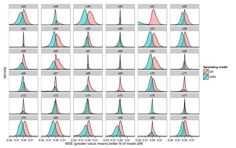
Here are all subject–model pairs for which the mean fit for the non-generating model was greater than the mean fit of the generating model.
rd(d = 6, ss(ddply(pb, .(s, model), function(s) c(MdMSE = mean(s$dMSE))),
    model == "model.diff" & MdMSE <= 0 |
        model == "model.ghlp" & MdMSE >= 0))
| s | model | MdMSE | |
|---|---|---|---|
| 7 | s50 | model.diff | -0.005421 |
| 14 | s53 | model.ghlp | 0.000001 |
| 30 | s61 | model.ghlp | 0.000217 |
| 31 | s62 | model.diff | -0.000099 |
| 39 | s67 | model.diff | -0.000389 |
| 47 | s71 | model.diff | -0.000448 |
| 49 | s72 | model.diff | -0.000173 |
| 55 | s75 | model.diff | -0.000619 |
Now let's look at the conditional probabilities for each subject. In the below plot, the x-axis specifies the probability that model.ghlp fit better given that model.ghlp was the generating model, and similarly for the y-axis with model.diff.
d = dcast(formula = s ~ model, value.var = "p",
    ddply(pb, .(s, model), function(slice) data.frame(p =
        mean((if (slice$model[1] == "model.diff") 1 else -1) *
            slice$dMSE > 0))))
ggplot(d) +
    geom_point(aes(model.ghlp, model.diff)) +
    coord_equal(xlim = c(.5, 1), ylim = c(.5, 1))
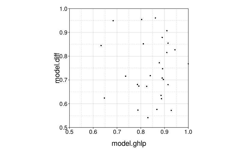
The points are clustered horizontally on the right, but are about uniform vertically. It looks like model.ghlp's data is less likely to be better fit by model.diff than the reverse.
The correlation isn't big:
round(digits = 3,
    cor(d$model.ghlp, d$model.diff, method = "kendall"))
| value | |
|---|---|
| 0.204 |
Collapsing across subjects, the means of the conditional probabilities are:
round(digits = 3, c(model.ghlp = mean(d$model.ghlp),
    model.diff = mean(d$model.diff)))
| value | |
|---|---|
| model.ghlp | 0.801 |
| model.diff | 0.680 |
This makes sense seeing as model.ghlp has one more parameter than model.diff.
Parameter-space exploration
With Diff as the generating model
Let's start by just fitting all the subjects with model.diff to get a sense of what reasonable parameter values are.
fits.diff = ordf(mse, `_data` = ddply(obsts, .(s), function(slice)
   {f = fit.model(slice, model.diff)
    as.data.frame(t(c(f$par, mse = f$mse)))}))
row.names(fits.diff) = char(fits.diff$s)
fits.diff = ss(fits.diff, select = -s)
rd(rbind(fits.diff,
    mapcols(fits.diff, function(v) quantile(v, c(.025, .975)))))
| kappa | rho | mse | |
|---|---|---|---|
| s53 | 15.904 | 0.043 | 0.009 |
| s62 | 1.467 | 0.309 | 0.024 |
| s61 | 0.004 | 2.636 | 0.030 |
| s48 | 24.448 | 0.007 | 0.037 |
| s76 | 7.127 | 0.028 | 0.038 |
| s77 | 724.508 | 0.001 | 0.040 |
| s56 | 1.134 | 0.211 | 0.042 |
| s64 | 2.346 | 0.092 | 0.052 |
| s66 | 1.456 | 0.115 | 0.054 |
| s71 | 0.216 | 0.659 | 0.061 |
| s73 | 0.778 | 0.207 | 0.061 |
| s59 | 0.562 | 0.306 | 0.061 |
| s67 | 0.128 | 0.555 | 0.065 |
| s68 | 11.608 | 0.018 | 0.067 |
| s55 | 0.886 | 0.179 | 0.069 |
| s74 | 0.740 | 0.262 | 0.070 |
| s63 | 4.865 | 0.022 | 0.071 |
| s69 | 0.900 | 0.164 | 0.075 |
| s54 | 2.217 | 0.051 | 0.076 |
| s83 | 1.039 | 0.147 | 0.080 |
| s84 | 0.512 | 0.193 | 0.085 |
| s70 | 0.895 | 0.119 | 0.089 |
| s82 | 0.371 | 0.250 | 0.100 |
| s60 | 0.875 | 0.082 | 0.107 |
| s52 | 0.729 | 0.119 | 0.113 |
| s57 | 1.093 | 0.081 | 0.114 |
| s51 | 0.801 | 0.097 | 0.122 |
| s81 | 0.361 | 0.172 | 0.126 |
| s72 | 0.022 | 2.647 | 0.127 |
| s75 | 0.073 | 0.244 | 0.128 |
| s58 | 0.419 | 0.148 | 0.142 |
| s49 | 0.697 | 0.066 | 0.165 |
| s79 | 0.445 | 0.113 | 0.169 |
| s50 | 0.000 | 0.079 | 0.190 |
| s80 | 0.436 | 0.059 | 0.211 |
| s30 | 0.642 | 0.024 | 0.230 |
| 2.5% | 0.004 | 0.006 | 0.022 |
| 97.5% | 111.955 | 2.637 | 0.214 |
All right, now, which portions of the parameter space are "interesting", in the sense of not resulting in degenerate choice patterns for the Builder test set?
llsgrid.diff = cached(local(
{grid = expand.grid(
kappa = exp(seq(-20, 10, len = 150)),
rho = exp(seq(-15, 20, len = 150)))
ddply(grid, .(kappa, rho), .progress = "text", function(row)
{pd = preddata(builder.test.ts, model.diff, num(row))
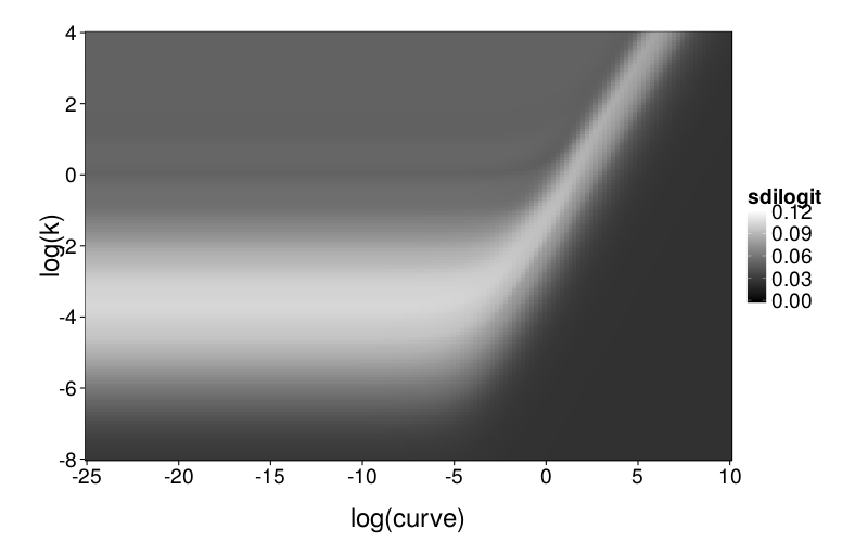
data.frame(expected.lls = mean(pd$pll), sdilogit = sd(ilogit(pd$pll)))})}))
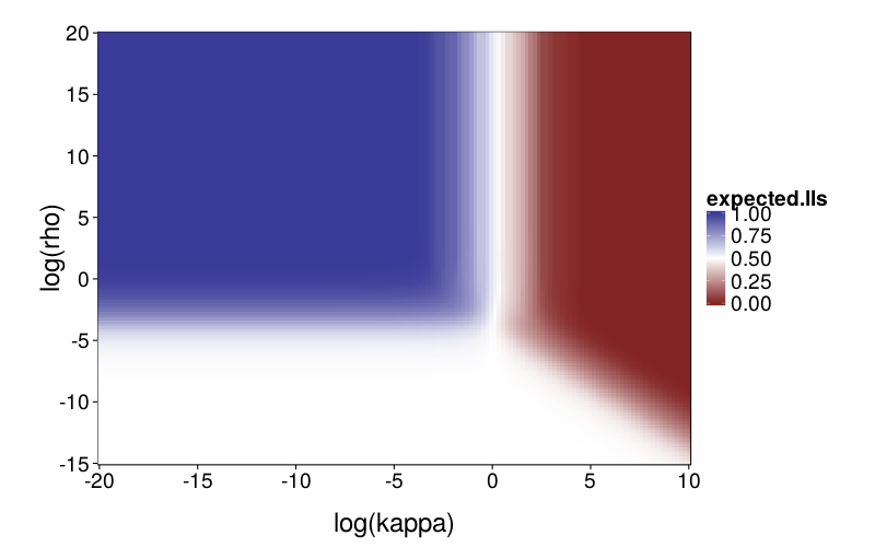
First, a graph of expected proportion of LLs chosen.
ggplot(llsgrid.diff) +
    geom_tile(aes(log(kappa), log(rho), fill = expected.lls)) +
    scale_fill_gradient2(midpoint = .5) +
    scale_x_continuous(breaks = seq(-20, 10, 5), expand = c(0, 0)) +
    scale_y_continuous(breaks = seq(-15, 20, 5), expand = c(0, 0))
Now a figure showing the standard deviation of the inverse logits of the choice probabilities across the test set. The higher this number, the more heterogeneity there is across the test set; when it's 0, the choice probability is constant.
ggplot(llsgrid.diff) +
    geom_tile(aes(log(kappa), log(rho), fill = sdilogit)) +
    scale_fill_continuous(low = "black", high = "white", limits = c(0, .12), na.value = "red") +
    scale_x_continuous(breaks = seq(-20, 10, 5), expand = c(0, 0)) +
    scale_y_continuous(breaks = seq(-15, 20, 5), expand = c(0, 0))
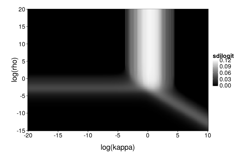
So we have roughly three regions where the model is interesting enough that checking for mimicry makes sense, corresponding to the white bar and the two gray bars. Or we could just examine the intersection point and the space around it. Yeah, that's what I'll do.
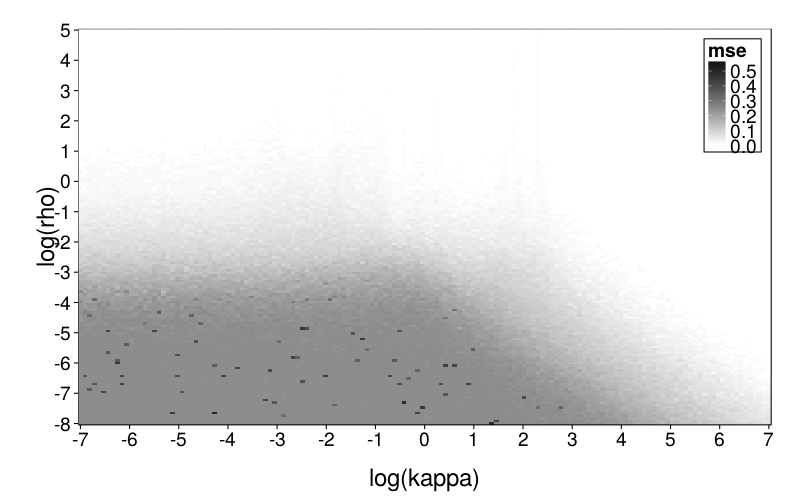
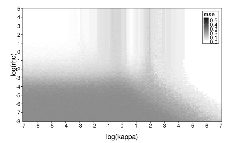
msegrid = function(fitting.model, n.replicates = 5)
   {grid = expand.grid(
        kappa = exp(seq(-7, 7, len = 150)),
        rho = exp(seq(-8, 5, len = 150)))
    cbind(grid, mse = aaply(1 : nrow(grid), 1, .progress = "text", function(i)
        median(replicate(n.replicates,
              # I take the median of MSEs from several replicates,
              # instead of just using one, in order to reduce
              # noise in the plots.
            fit.model(model = fitting.model, ts =
                gendata(builder.test.ts, model.diff, num(grid[i,])))$mse))))}

plot.msegrid = function(g) ggplot(g) +
    geom_tile(aes(log(kappa), log(rho), fill = mse)) +
    scale_x_continuous(breaks = -7:7, expand = c(0, 0)) +
    scale_y_continuous(breaks = -8:5, expand = c(0, 0)) +
    inset.legend(c(1, 1))

msegrid.diff = cached(msegrid(model.diff))
msegrid.ghlp = cached(msegrid(model.ghlp))
plot.msegrid(msegrid.diff) +
     scale_fill_continuous(
         high = "black", low = "white", na.value = "red",
         limits = c(0, .6))
This seems to generally make sense. The upper part of the plot is white because rho is high and therefore there's little noise in the data; the lower part is dark gray because rho is low and therefore the data is mostly noise. I'm not sure what to make of the very pale gray spike.
plot.msegrid(msegrid.ghlp) +
     scale_fill_continuous(
         high = "black", low = "white", na.value = "red",
         limits = c(0, .6))
This looks weirder, which makes sense considering that the generating and fitting models no longer match. In general, ghlp has trouble with that central column.
Now for the difference grid.
plot.msegrid(transform(msegrid.ghlp, mse = mse - msegrid.diff$mse)) +
     scale_fill_gradient2() +
     geom_point(data = data.frame(fits.diff),
        aes(log(kappa), log(rho)), shape = "x", size = 5) +
     coord_cartesian(xlim = c(-7, 7))
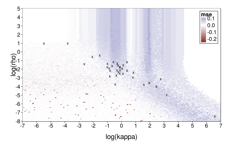
model.diff generally does better, particularly in the central column. It's nice that the parameter vectors estimated from the subjects are in regions of reasonable favor towards diff. (Note that one subject, whose estimated kappa was very small, is omitted.)
With GH as the generating model
Again, let's start with point estimates for the real data.
fits.ghlp = ordf(mse, `_data` = ddply(obsts, .(s), function(slice)
   {f = fit.model(slice, model.ghlp)
    data.frame(
        log.curve = log(f$par["curve"]),
        log.k = log(f$par["k"]),
        log.rho = log(f$par["rho"]),
        mse = f$mse)}))
row.names(fits.ghlp) = char(fits.ghlp$s)
fits.ghlp = ss(fits.ghlp, select = -s)
rd(d = 2, rbind(fits.ghlp,
    mapcols(fits.ghlp, function(v) quantile(v, c(.025, .975))),
    mapcols(fits.ghlp, range)))
| log.curve | log.k | log.rho | mse | |
|---|---|---|---|---|
| s53 | -10.06 | -1.15 | -1.08 | 0.01 |
| s62 | -16.85 | -2.73 | -0.82 | 0.02 |
| s61 | -13.00 | -8.32 | 0.93 | 0.03 |
| s56 | -18.94 | -3.04 | -0.77 | 0.04 |
| s77 | -9.31 | -1.01 | -1.49 | 0.04 |
| s76 | -14.93 | -1.66 | -1.45 | 0.04 |
| s48 | -13.63 | -1.54 | -1.55 | 0.04 |
| s66 | -10.66 | -2.85 | -1.29 | 0.05 |
| s64 | -2.86 | -1.93 | -1.39 | 0.05 |
| s59 | -18.47 | -3.75 | -0.33 | 0.05 |
| s73 | -13.25 | -3.39 | -1.01 | 0.06 |
| s71 | -4.83 | -4.38 | 0.14 | 0.06 |
| s55 | -17.31 | -3.28 | -1.06 | 0.06 |
| s68 | -15.94 | -1.51 | -1.65 | 0.07 |
| s74 | -20.68 | -3.47 | -0.81 | 0.07 |
| s67 | -2.41 | -4.11 | 2.61 | 0.07 |
| s83 | -15.77 | -3.10 | -1.31 | 0.07 |
| s69 | -4.85 | -3.13 | -1.14 | 0.07 |
| s84 | -18.56 | -3.86 | -0.85 | 0.08 |
| s54 | -2.05 | -1.76 | -1.58 | 0.08 |
| s63 | -16.73 | -2.04 | -1.79 | 0.08 |
| s82 | -20.39 | -4.18 | -0.53 | 0.08 |
| s70 | -20.00 | -3.27 | -1.34 | 0.09 |
| s51 | 2.16 | 0.37 | -0.52 | 0.09 |
| s60 | -16.41 | -3.22 | -1.60 | 0.10 |
| s52 | -15.59 | -3.38 | -1.49 | 0.11 |
| s57 | -19.30 | -2.95 | -1.71 | 0.11 |
| s72 | -18.92 | -5.36 | -1.18 | 0.11 |
| s75 | -17.60 | -5.37 | -1.20 | 0.12 |
| s81 | -3.09 | -3.45 | -0.96 | 0.13 |
| s58 | -6.22 | -3.96 | -1.33 | 0.14 |
| s49 | -16.49 | -3.40 | -1.91 | 0.16 |
| s79 | -19.02 | -3.95 | -1.50 | 0.16 |
| s50 | 0.56 | -18.15 | -2.53 | 0.19 |
| s80 | -18.57 | -3.89 | -2.09 | 0.20 |
| s30 | -1.76 | -2.34 | -2.45 | 0.23 |
| 2.5% | -20.42 | -9.55 | -2.46 | 0.02 |
| 97.5% | 0.76 | -0.83 | 1.14 | 0.20 |
| 39 | -20.68 | -18.15 | -2.53 | 0.01 |
| 40 | 2.16 | 0.37 | 2.61 | 0.23 |
Now, I can't very well use heatmaps and so on with a three-dimensional parameter space, so we have to more or less drop a parameter. Christian suggested dropping rho, since it is theoretically the least important parameter; makes sense to me. Let's freeze it at the median (which is the same thing as the antilog of the median of the logs).
rho.med = exp(median(fits.ghlp$log.rho))
c(
   "median of logs" = median(fits.ghlp$log.rho),
   "median" = rho.med)
| value | |
|---|---|
| median of logs | -1.2955832 |
| median | 0.2737382 |
Now let's get point estimates again with rho fixed at rho.med:
model.ghlp.mr = model.ghlp.frho(rho.med)
fits.ghlp.mr = ordf(mse, `_data` = ddply(obsts, .(s), function(slice)
   {f = fit.model(slice, model.ghlp.mr)
    data.frame(
        log.curve = log(f$par["curve"]),
        log.k = log(f$par["k"]),
        mse = f$mse)}))
row.names(fits.ghlp.mr) = char(fits.ghlp.mr$s)
fits.ghlp.mr = ss(fits.ghlp.mr, select = -s)
rd(d = 2, rbind(fits.ghlp.mr,
    mapcols(fits.ghlp.mr, function(v) quantile(v, c(.025, .975))),
    mapcols(fits.ghlp.mr, range)))
| log.curve | log.k | mse | |
|---|---|---|---|
| s53 | -7.59 | -1.00 | 0.01 |
| s62 | -16.89 | -2.61 | 0.02 |
| s56 | -20.44 | -3.00 | 0.04 |
| s77 | -8.82 | -1.14 | 0.04 |
| s76 | -11.17 | -1.67 | 0.04 |
| s48 | -11.17 | -1.57 | 0.04 |
| s61 | 0.07 | -Inf | 0.05 |
| s66 | -19.31 | -2.85 | 0.05 |
| s64 | -2.25 | -1.83 | 0.05 |
| s73 | -20.19 | -3.36 | 0.06 |
| s59 | -19.38 | -3.64 | 0.06 |
| s55 | -18.83 | -3.25 | 0.06 |
| s68 | -1.15 | -1.07 | 0.07 |
| s74 | -21.40 | -3.40 | 0.07 |
| s83 | -17.47 | -3.10 | 0.07 |
| s69 | -13.84 | -3.19 | 0.07 |
| s67 | -20.41 | -5.04 | 0.08 |
| s54 | -0.92 | -1.39 | 0.08 |
| s84 | -19.75 | -3.80 | 0.08 |
| s70 | -18.18 | -3.28 | 0.09 |
| s63 | -11.76 | -2.01 | 0.09 |
| s71 | -8.38 | -4.62 | 0.09 |
| s82 | -20.71 | -4.12 | 0.09 |
| s51 | 0.82 | -0.59 | 0.10 |
| s60 | -6.02 | -3.24 | 0.11 |
| s52 | -5.41 | -3.36 | 0.11 |
| s72 | -19.55 | -5.38 | 0.11 |
| s57 | -14.58 | -3.12 | 0.11 |
| s75 | -19.41 | -5.38 | 0.12 |
| s81 | -3.74 | -3.66 | 0.13 |
| s58 | -5.86 | -3.94 | 0.14 |
| s79 | -19.43 | -3.97 | 0.16 |
| s49 | -3.00 | -3.01 | 0.16 |
| s50 | 137.35 | 129.03 | 0.21 |
| s80 | -5.53 | -3.93 | 0.21 |
| s30 | 1.18 | -0.52 | 0.25 |
| 2.5% | -20.80 | -Inf | 0.02 |
| 97.5% | 18.20 | 15.67 | 0.22 |
| 39 | -21.40 | -Inf | 0.01 |
| 40 | 137.35 | 129.03 | 0.25 |
Removing outliers:
d = ss(fits.ghlp.mr, (log.curve < 100 | log.k < 100) & is.finite(log.k))
rd(d = 3, rbind(
    mapcols(d, function(v) quantile(v, c(.025, .975))),
    mapcols(d, range)))
| log.curve | log.k | mse | |
|---|---|---|---|
| 2.5% | -20.834 | -5.382 | 0.022 |
| 97.5% | 0.883 | -0.582 | 0.220 |
| -21.397 | -5.384 | 0.009 | |
| 1.175 | -0.524 | 0.246 |
llsgrid.ghlp.mr = cached(local(
   {grid = expand.grid(
        curve = exp(seq(-25, 10, len = 150)),
        k = exp(seq(-8, 4, len = 150)))
    ddply(grid, .(curve, k), .progress = "text", function(row)
       {pd = preddata(builder.test.ts, model.ghlp.mr, num(row))
        data.frame(expected.lls = mean(pd$pll), sdilogit = sd(ilogit(pd$pll)))})}))
ggplot(llsgrid.ghlp.mr) +
    geom_tile(aes(log(curve), log(k), fill = sdilogit)) +
    scale_fill_continuous(low = "black", high = "white", limits = c(0, .12), na.value = "red") +
    scale_x_continuous(breaks = seq(-25, 10, 5), expand = c(0, 0)) +
    scale_y_continuous(breaks = seq(-8, 4, 2), expand = c(0, 0))
msegrid.mr = function(fitting.model, n.replicates = 5)
   {grid = expand.grid(
        curve = exp(seq(-25, 10, len = 150)),
        k = exp(seq(-8, 4, len = 150)))
    cbind(grid, mse = aaply(1 : nrow(grid), 1, .progress = "text", function(i)
        median(replicate(n.replicates,
              # I take the median of MSEs from several replicates,
              # instead of just using one, in order to reduce
              # noise in the plots.
            fit.model(model = fitting.model, ts =
                gendata(builder.test.ts, model.ghlp.mr, num(grid[i,])))$mse))))}

plot.msegrid.mr = function(g) ggplot(g) +
    geom_tile(aes(log(curve), log(k), fill = mse)) +
    scale_x_continuous(breaks = seq(-25, 10, 5), expand = c(0, 0)) +
    scale_y_continuous(breaks = seq(-8, 4, 2), expand = c(0, 0)) +
    inset.legend(c(1, 0))

msegrid.mr.diff = cached(msegrid.mr(model.diff))
msegrid.mr.ghlp = cached(msegrid.mr(model.ghlp))
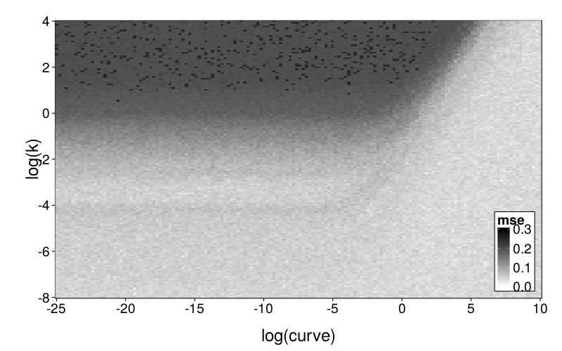
plot.msegrid.mr(msegrid.mr.ghlp) +
     scale_fill_continuous(
         high = "black", low = "white", na.value = "red",
         limits = c(0, .3), breaks = seq(0, .3, .1))
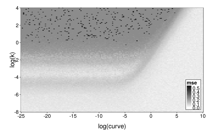
plot.msegrid.mr(msegrid.mr.diff) +
     scale_fill_continuous(
         high = "black", low = "white", na.value = "red",
         limits = c(0, .6))
The difference grid:
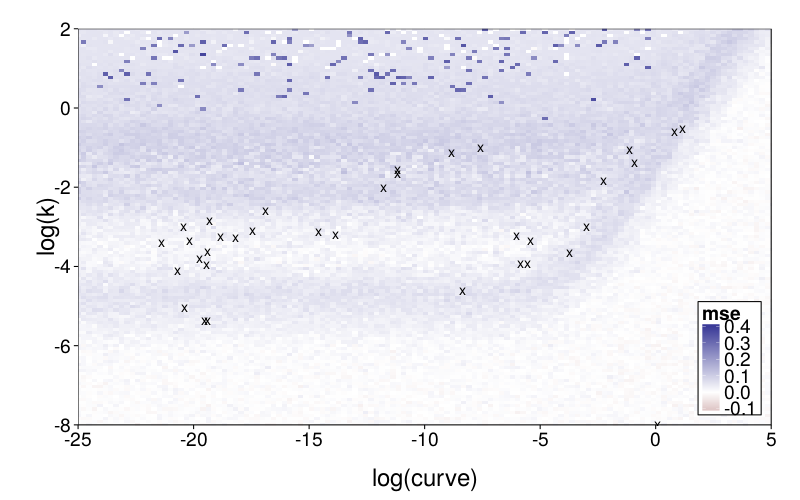
plot.msegrid.mr(transform(msegrid.mr.diff, mse = mse - msegrid.mr.ghlp$mse)) +
     scale_fill_gradient2(limits = c(-.1, .4)) +
     geom_point(data = data.frame(fits.ghlp.mr),
        aes(log.curve, log.k), shape = "x", size = 5) +
     coord_cartesian(xlim = c(-25, 5), ylim = c(-8, 2))
Writeup
Intro
Each of the previous studies compared two discounting models to each other. In this study, we compared the most general of the discounting models, GH, with an attribute-based model, Diff. One might expect that even if discounting models are highly capable of mimicking each other, a model that uses an entirely different approach to intertemporal choice may not be so capable of mimicking a discounting model, nor vice versa.
Method
We parametrized GH with the log-odds of choosing LL set to
with α ≥ 0, β > 0, and ρ > 0. We parametrized Diff with the log-odds of choosing LL set to
with κ > 0 and ρ > 0. We estimated model parameters by minimizing MSE with GNU R's function optim using its default Nelder-Mead method, along with some explicit logic to ensure that parameters were chosen to obtain MSE 0 when the input data was all-SS or all-LL. As our set of quartets for parameter-space exploration, we used Arfer and Luhmann's (2015) standard set of 100.
Results and discussion
fig--g/pb-densities shows density plots of parametrically bootstrapped model fit (MSE) for each subject and each generating model. For most subjects and models, the mean fit favors the generating model. (The exceptions are subjects s53 and s61, for whom Diff achieves better mean fit when GH is the generating model, and subjects s50, s62, s67, s71, s72, and s75, for whom the reverse holds.) Still, one can see substantial visible overlap between bootstrap distributions. Collapsing across subjects, we find that when GH is the generating model, it achieves better fit than Diff in 80% of replicates, whereas when Diff is the generating model, it achieves better fit than GH in 68% of replicates. Thus, discrimination on the basis of model fit usually decides correctly, but has a non-negligible error rate, and is biased towards choosing GH. This bias is consistent with the models' different numbers of parameters: GH has 3 parameters whereas Diff has 2.
To explore mimicry with Diff as the generating model across its parameter space, we first needed to choose the rectangular section of the parameter space to inspect. Per-subject point estimates for original data had ranging from −8 to 1 and ranging from −6 to 7, excepting one subject (s50) with an estimated of −16. fig--g/diff-sd is a heatmap of the SD of inverse logits of choice probabilities across the Arfer and Luhmann (2015) quartets given Diff with the given parameter pair as the generating model. The darker each pixel of the heatmap, the closer the data is to being degenerate, with all choice probabilities being equal. Thus, the nontrivial portions of the parameter space (relative to the Arfer and Luhmann quartets) are given by the lighter regions. On this basis, we decided to inspect from −8 to 5 and from −7 to 7. fig--g/dmsegrid is a heatmap of the difference of model fits of GH and Diff for data generated by Diff with each parameter pair, where positive MSE indicates greater fit by Diff. The original estimate for each subject is marked by a cross (all subjects are visible except s50). Observe that in nontrivial portions of the parameter space, Diff indeed achieves better fit, and subjects tend to cluster in areas where Diff achieves better fit.
To explore mimicry with GH as the generating model across its own parameter space, we again needed to choose a rectangular section of the parameter space to inspect. Since GH has 3 parameters, this required dropping a dimension. We opted to drop ρ because it is the least theoretically important parameter. We did this by making per-subject point estimates with all parameters free to vary, and calculating the median of the estimated ρ values, which was 0.274. We then redid these estimates with ρ fixed at the median, yielding ranging from −22 to 2 and ranging from −6 to 0, excepting one subject (s50) with estimates of 137 and 129 (respectively) and another subject (s61) with a estimate of −∞ (i.e., with β = 0). fig--g/ghlp-mr-sd is a heatmap similar to fig--g/diff-sd, and fig--g/dmsegrid-mr is similar to fig--g/dmsegrid but with positive values meaning greater fit for GH. (Note that although all data was generated with a single value of ρ, ρ was free to vary when GH was fitted for fig--g/dmsegrid-mr.) The overall impression is similar to that given in the parameter-space exploration of Diff, but stronger. The only large advantages in terms of fit are in GH's favor, and subjects' estimates tend to be in regions of such advantages.
In summary, the parametric-bootstrapping analyses as well as the two parameter-space explorations all consistently suggest that Diff and GH are not always easy to distinguish, but on average, model fit strongly favors the generating model.
References
Arfer, K. B., & Luhmann, C. C. (2015). The predictive accuracy of intertemporal-choice models. British Journal of Mathematical and Statistical Psychology. Advance online publication. doi:10.1111/bmsp.12049. Retrieved from http://arfer.net/projects/builder/paper
Loewenstein, G., & Prelec, D. (1992). Anomalies in intertemporal choice: Evidence and an interpretation. Quarterly Journal of Economics, 107(2), 573–597. doi:10.2307/2118482
Scholten, M., & Read, D. (2013). Time and outcome framing in intertemporal tradeoffs. Journal of Experimental Psychology: Learning, Memory, and Cognition, 39(4), 1192–1212. doi:10.1037/a0031171
Wagenmakers, E.-J., Ratcliff, R., Gomez, P., & Iverson, G. J. (2004). Assessing model mimicry using the parametric bootstrap. Journal of Mathematical Psychology, 48(1), 28–50. doi:10.1016/j.jmp.2003.11.004